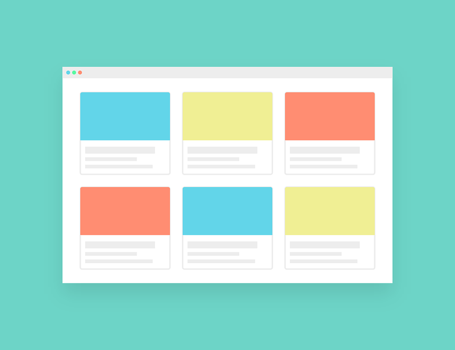
Flat design is a user interface design that employs simple and two-dimensional elements with bright colors. It is the exact opposite of the skeuomorphic style that creates three-dimension illusions by copying real-life properties. Flat design became popular with the release of iOS 7, Windows 8, and Google’s Material Design.

(Pixabay / janjf93)
Flat design was created for responsive design, which allows the content of a website to scale smoothly based on the screen size of the device. Flat design will load quickly, even on mobile devices with slower speeds, because it uses simple shapes and minimal textures.
Flat design emphasizes usability, open space, and clean interface, resulting in a pleasing aesthetic on the website. As a result, it facilitates a unique look that will personalize your brand. It eliminates the unnecessary fluff that is often found in 3D skeuomorphic web design.
The following are the advantages of flat design:
- Clean – Flat design eliminates the sense of depth, which required the use of drop shadows, strokes, and gradients in creating real-world shapes.
- Streamlined –Sites that use flat design offer clean layouts, unlike skeuomorphic design that relied heavily on 3D effects, animation, and flashy embellishments. Flat design uses simple lines and vibrant colors in creating an impressive UI design.
- Uses bold typography – Many of the complex elements common to skeuomorphic design gave way to the use of bold typography in flat design. This new, creative use of typography is exciting and appealing to viewers.
- Creates a clear hierarchy of elements – Flat design’s use of bold color schemes in light and dark variations allows viewers to clearly distinguish between UI elements.
- Simple – Flat design uses simple interface items such as buttons, icons, and regular shapes such as square or rectangle. The result is simple and refreshing.
The following are the disadvantages of flat design:
- The trend may not last – Since flat design is a relatively new style, no one can predict its staying power. It is popular for now, but websites that rely on this style may become dated after a while if flat design goes out of style.
- Usability concerns – Not every user will be comfortable with the interface of the flat design. Some may not know where to click, which can hinder its usability.
- Color matching challenges – If you use a lot of colors in your design, it may be difficult to match them properly, creating disharmony.
- Exposes weak typography – Flat design results in a focus on typography. If a website uses bad typography, it will be glaringly obvious.
There is no perfect website design, but flat design offers many benefits. Weigh the pros and cons carefully, keeping the needs of your site and preferences of your target audience in mind.
