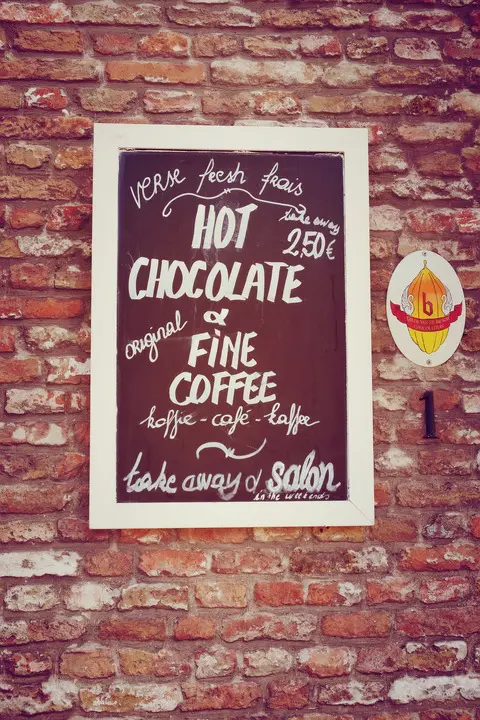
A poster can be a powerful promotional tool. It can catch people’s attention in a bold way and invite people to learn more about your product, service, or event. To make your poster shine, follow these tips:

(Pixabay / catalinserban)
- Know your audience — Before you start thinking of what to include on your poster, know who you want to view it. Your poster should speak directly to the people you want to purchase your product or attend your event. A vague, “to whom it may concern” poster will not be effective.
- Prioritize your information — There are plenty of details that you will want to share with your audience, but the poster won’t be able to convey all of them. If you try to cram everything onto a poster, your message will become noisy and ineffective. Share only the most critical details on your poster.
- Include a call-to-action — Your poster should spur people to take some course of action. Make it clear what you want your audience to do after seeing your poster.
- Use text sparingly — A poster should grab people’s attention, but it doesn’t need to tell a full story. Use only essential text, and let visual elements do the rest.
- Make your message clear — You can include the most eye-catching visual elements, but if the goal of your poster is not clear, it will fall flat. For example, if you create a poster for an event and forget to include the time, you will have a big problem on your hands.
- Super-size it — A poster is supposed to be big. Use large designs and high resolutions as well as bold and eye-catching colors. Make sure that your text can be read from a distance. And your headline should tell it all. Make it concise and clear. After all, your headline will be the first item that people see on the poster.
Make your next poster a more compelling marketing tool by following these tips for design.
